- Home
- Components
- External Resources
- Layout Icons
- Less API
- Manual Testing
- Naming Things
- Starting a New Theme
- Pattern Guide
- Recipes
- Theme Customization
- Twig API
Theme Handbook Pattern Guide
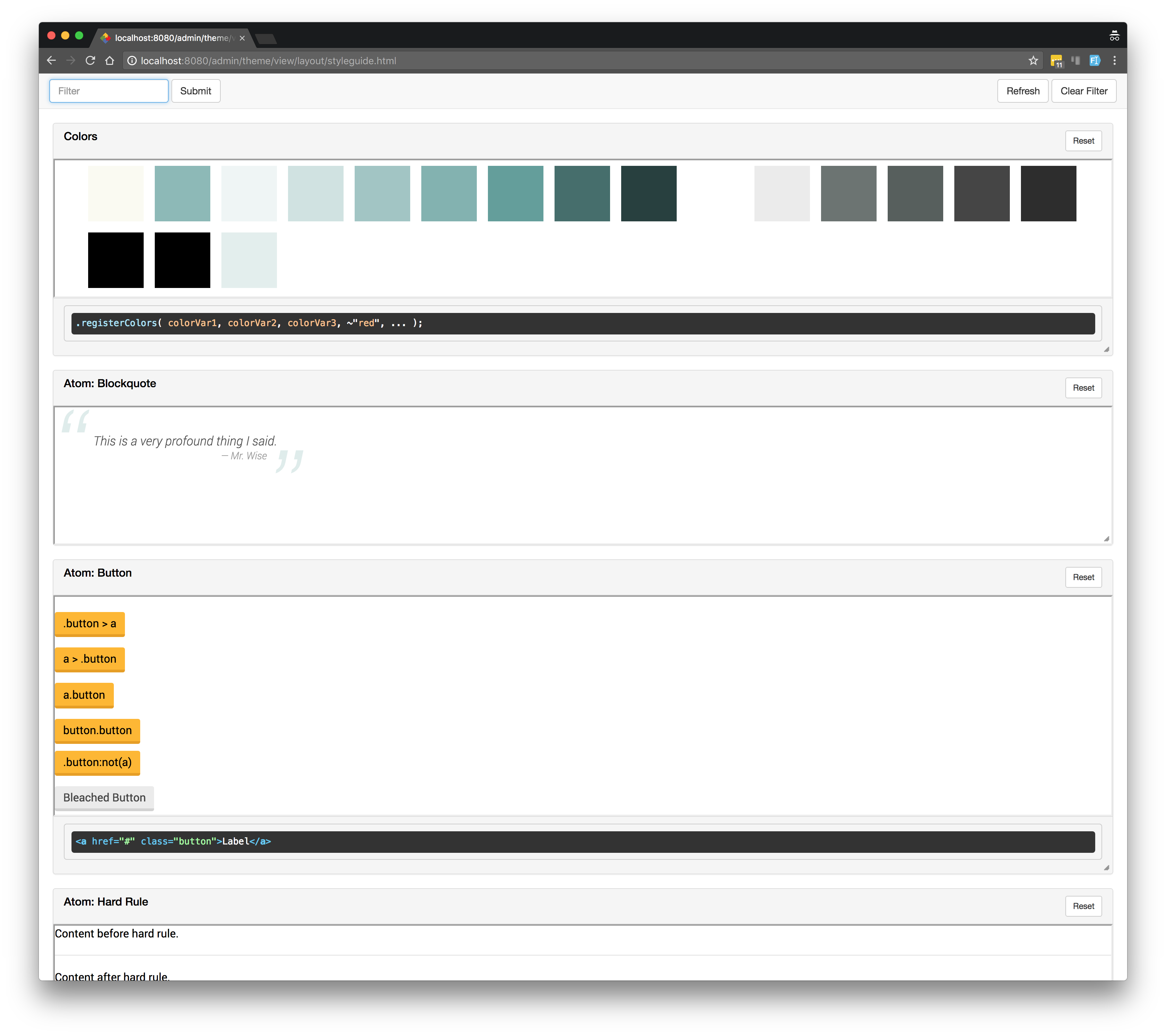
ThemePatternGuide ships with most recent themes SimpleUpdates has developed. The tool generates a style guide which helps in theme development and testing.
Accessing a Theme’s Style Guide
To access a theme’s style guide, first activate the theme and then append the following path to your domain name in your browser’s URL bar:
/admin/theme/view/layout/styleguide.html
Toolbar
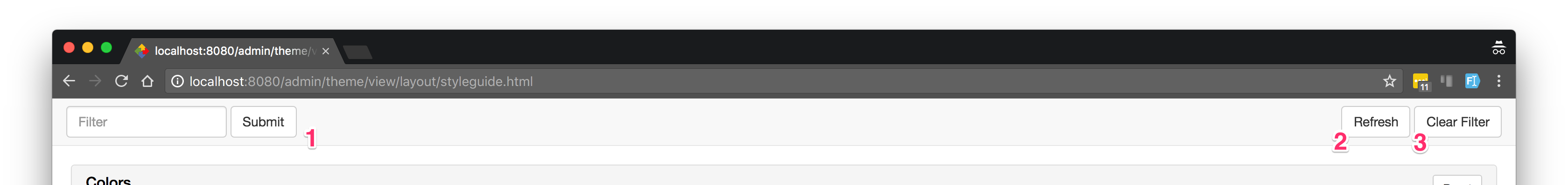
The toolbar at the top of the style guide allows you to:
- Filter all components by title
- Refresh the page, retaining any applied filtering
- Clear all filters
Components
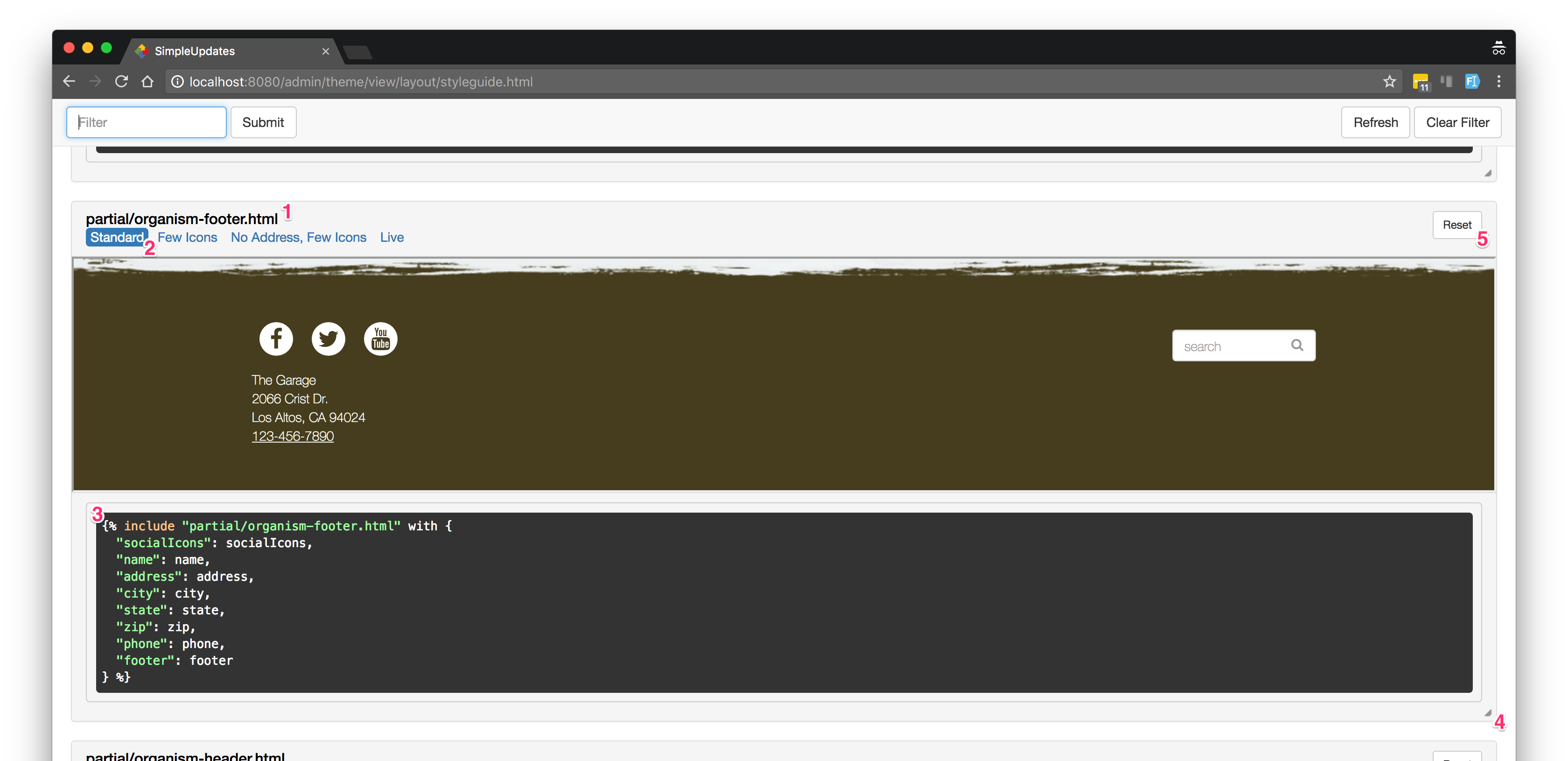
Each pattern in the guide includes several additional controls and pieces of information:
- The component’s title. Click the component’s title to view only this specific component.
- Scenario selector. This allows for viewing the component with different sets of content. Not all components include scenarios.
- Usage hint. This field contains information about how to use the component in a theme file. Not all components include a usage hint.
- Resize handle. Drag the handle to see how the component reacts to different screen sizes.
- Resize reset button. Use this button to return the component to its original size.
Registering a New Component
Any theme which ships with a style guide should include a styleguide.html layout in the theme’s “layout” folder. This
is where theme-specific components are registered. All components should be registered within the content block in
this layout.
Simple components can be registered very easily:
{% include "dev/pattern-include.html" with { partial: "partial/molecule-nav.html" } %}
This snippet registers a new component found in the partial file partial/molecule-nav.html.
In addition, scenarios and parameters (used in generating the usage hint) can be supplied using the pattern-include
syntax:
{% include "dev/pattern-include.html" with {
	partial: "partial/atom-hero.html",
	scenarios: {
		"Unsplash": {
			"imageUrl": "https://unsplash.it/1169/595/?random"
		}
	},
	params: [ "imageUrl", "classes" ]
} %}
At times, you may wish to hand-craft your own style guide component, instead of allowing the boilerplate to be auto-generated. In such cases, you’ll need to use a substantially more verbose syntax:
{% embed "dev/pattern.html" with { name: "Atom: Button" } %}
	{% block scenarios %}
		{% embed "dev/scenario.html" %}
			{% block scenario %}
				<br />
				<p><span class="button"><a href="#">.button > a</a></span></p>
				<p><a href="#"><span class="button">a > .button</span></a></p>
				<p><a href="#" class="button">a.button</a></p>
				<p><button class="button">button.button</button></p>
				<p><span class="button">.button:not(a)</span></p>
				<p><span class="button bleached"><a target="_blank" href="#">Bleached Button</a></span></p>
			{% endblock %}
		{% endembed %}
	{% endblock %}
	{% block usage %}{{ '<a href="#" class="button">Label</a>'|e }}{% endblock %}
{% endembed %}
You can add multiple scenarios to your component by creating multiple dev/scenario.html embeds within the scenarios
block.
The Color Component and Color Registration
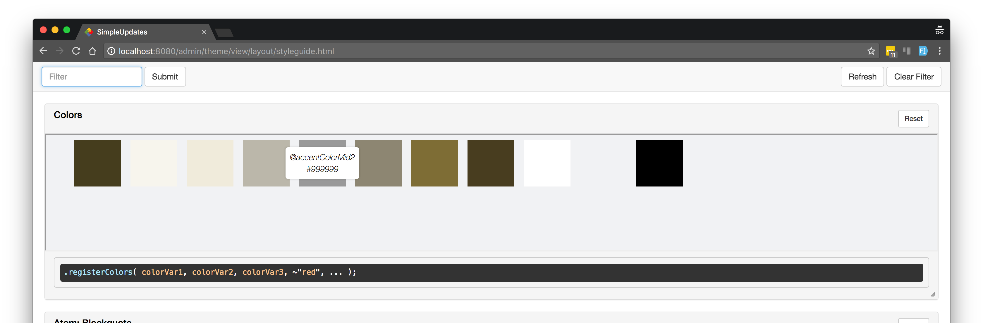
One of the components which the styleguide always comes with is the “Colors” component. This component displays colors
registered by the theme in global.less.
Hover over a color to see its Less variable name and final hex value.
Color variables are registered in a theme’s global.less file this way:
	@import (optional) "../dev/styleguide";

	/* ~"color" explanation: https://github.com/less/less.js/issues/1595 */
	@registeredColors:
		accentColor,
		accentColorBleached,
		accentColorLight,
		accentColorMid1,
		accentColorMid2,
		accentColorMid3,
		accentColorDim,
		accentColorDark,
		~"white",
		~"lightGray",
		~"black";
There are three important things to notice here:
styleguide.lessmust be imported before you register your color variables, and it should be imported with the(optional)keyword to avoid potentially breaking the theme.- Variable names are not registered with an initial
@symbol. - Variable names which could conflict with CSS color names should be
escaped (example:
~"red").